
Communication - Top Tips for Presenting Content Online
- frankquattromani
- May 30, 2022
- 4 min read
It is essential that any online material is presented in a user-friendly format so that it does not detract from the learning experience. Follow this list of top tips to ensure that your online content looks professional, accessible, interactive and easy to read.
Establish a clear and consistent design
Pages with a range of fonts and colours do not make for easy reading. Establish the overall ‘look’ of your site at the outset and ensure consistency throughout. Slight, occasional variations for emphasis are fine, but the overall appearance should remain the same.
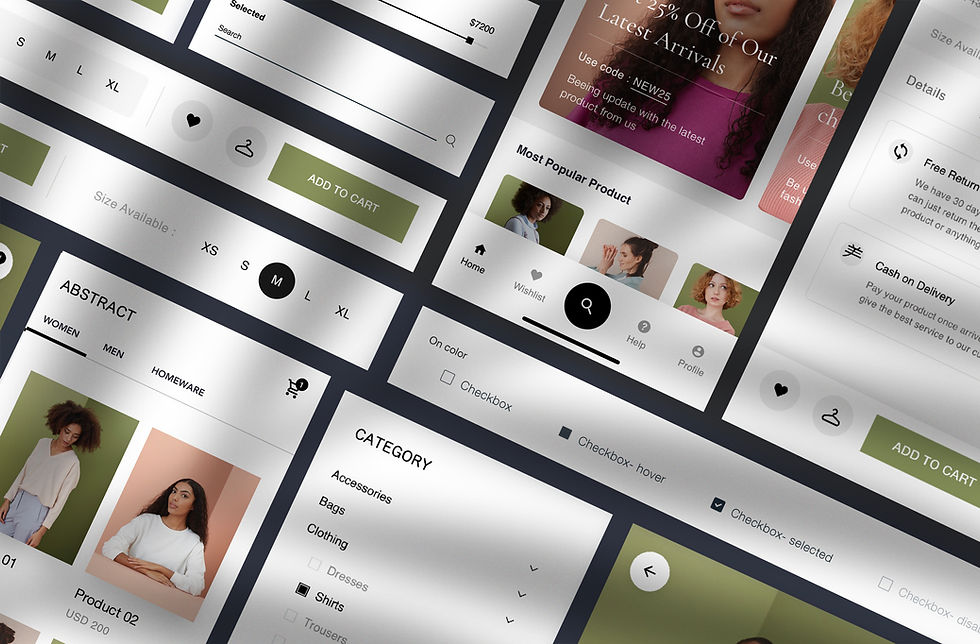
Consider the colour palette being used – learners need to be able to read text on screen without straining to see it. Dark text on a light background, or vice versa, is always best.
Unless you are an experienced web designer, it is recommended that you stick to web safe typefaces: Times New Roman, Arial (the Mac equivalent of which is Helvetica), Verdana, Georgia, Comic Sans Serif, Trebuchet MS, and Courier New. These are typefaces that are installed on most computers. If a user does not have a typeface on their computer, the internet browser selects its own replacement (unless you have coded your content to select one) which may give the page an uneven look.
Generally, it is better to use sans serif typefaces, i.e. those that do not have fine lines at the end points of letters. These are easier to read onscreen than their serif counterparts. Arial, Verdana and Trebuchet MS are all examples of sans serif typefaces.
Make navigation simple and straightforward
Complex navigation systems will prove extremely frustrating for learners. Whatever your site’s set-up, it should be easy for someone to get to where they want to go, and they shouldn’t need to click through a number of pages or links to get there. Try to have a contents or navigation section visible at all times.
Having to continually start from page one each time a person starts a new session is not effective design, so ensure that it is easy for people to pick up where they left off.
Break up your text
Although presenting content online has many positives, it is not the ideal medium for reading dense pieces of text. Presenting a big block of words on screen can look unappealing, and learners may feel overwhelmed or be tempted to navigate past the page. Alternatively, they could feel the need to print off the text so that they can read it off-screen, which somewhat defeats the purpose.

If you need to use a lot of text and it's all relevant, break the words down into logical sections. Spread them out over a few pages, so that readers feel they are digesting it in manageable chunks. Try using short paragraphs and bullet points.
The reverse is also true – don’t spread a small number of words over five pages.
Use effects sparingly
Although it is tempting to make use of all the tools of the web (graphics, audio, animation etc.) if you have objects flying around or music starting up for no reason, it just confuses or, worse, irritates users.
Instead, use effects sensibly: a graphic that illustrates a diagram, an animation that runs through a process, or an audio file that is relevant to the subject matter.
Use interactive elements appropriately
Interactivity can bring online content to life and enhance the overall experience. A well-placed interactive questionnaire or exercise, for example, can consolidate knowledge and check the user's understanding before moving on to a new section. However, when interactive methods are used for the sake of it, they can be distracting.
An example of this is including hypertext links throughout text. (A hypertext link is when a word or phrase is made ‘active’ so that clicking on it takes a user to a separate page or site.) Too many of these can confuse the user – should they remain on the current page, or are they expected to go exploring other pages or sites by following the links?
Hypertext links should therefore be presented in a sensible and logical fashion. Those that are merely useful, or of supplementary interest, should be stored in a separate ‘Further Information’ section.
Be accessible
‘Accessibility’ is a term that refers to making your content as open to as many people as possible, particularly those with disabilities. Many organisations now have accessibility guidelines and will insist that any web content conforms to accepted accessibility standards.
An example of good accessibility practice includes ‘tagging’ images so that visually impaired learners using a screen reader are given a description of that image. Another example is ensuring that ‘clickable’ areas are large enough to be selected by those unable to use a mouse precisely.
Most recent bespoke e-learning or online content creation packages will have gone through their own internal accessibility checks, and can probably be used safely. However, the end result should still go through your own accessibility audit to ensure that there are no issues.
For a full breakdown on web accessibility standards visit the Web Content Accessibility Guidelines 2.0 page.
Look at content from all angles
Try out your pages on a few different web browsers and screen resolutions. What may look clean and readable in Internet Explorer on a screen set at resolution of 1280 x 800 might not render well in Firefox at 800 x 600.
If possible, establish which operating systems and resolutions your users will most commonly be working with. Take the time at the start of the design process to ensure that the methods you are using to produce your content will give good results in these formats.
Reference: https://app.goodpractice.net/
Comments